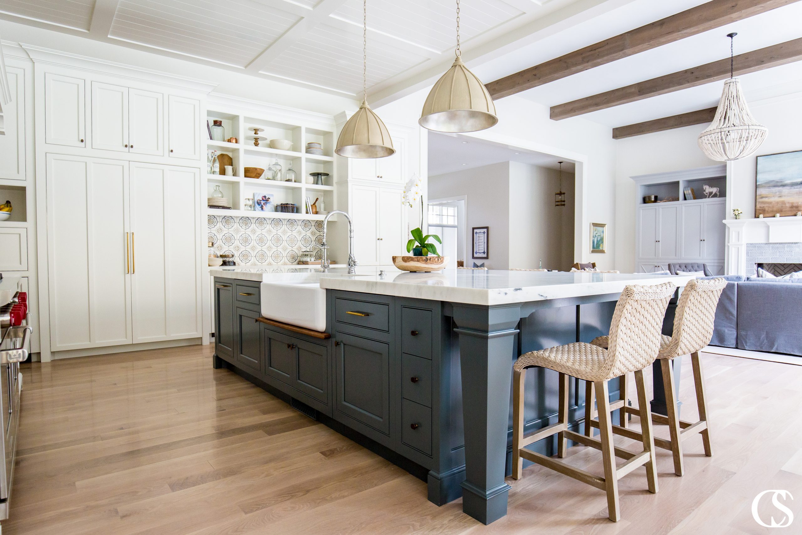
There are a seemingly infinite number of interior paint color combinations. When you throw various brands and finishes into the mix, choosing the perfect paint can quickly become overwhelming. Paint is the finishing touch on your project, and selecting the right paint can make all the difference. I love using Farrow and Ball paint colors on projects because it’s a durable paint that stands up to wear and tear, leaving your project looking its best for longer. Some of my favorite Farrow and Ball paint colors will compliment any home, making them the perfect choice.
How To Choose Farrow And Ball Paint Colors
Whether you’re the type to rush out and commit to the first paint swatch you see, or stare for months at paint swatch cards you’ve taped to your walls, a few simple tips can help you choose the best Farrow and Ball interior paint. Follow these tips to take the guesswork out of choosing paint colors, and get it right every time. No more painter’s remorse after a long day of painting!
Think About the Other Elements in the Room
It’s easy to focus on the Farrow and Ball paint colors and forget about the other elements in the room. When selecting paint colors for kitchens, paint colors for bedrooms, paint colors for bathrooms, or paint colors for living rooms, think about the existing colors already at play in the room. Whether it’s furniture, artwork, flooring, window treatments, or accessories, make sure your paint color of choice won’t clash.
Take Your Time Deciding
Since you will have to live with the paint color you choose, it’s a good idea to take your time making a decision. There are a lot of nuances to paint colors, and the longer you look at them, the more you’ll be able to see them. Buying sample paints and testing them out in your home can help you pick a winner, and may save you the hassle of having to redo things because you changed your mind.
Look for Undertones
Paint colors can look very different depending on the lighting. For example, even my favorite gray paints can look more beige, blue, purple, or green in certain lights. The different colors you see are called undertones, and different kinds of lighting, or even the colors in your furniture and decor can highlight undertones. That’s another reason why it’s a good idea to test paint samples so you can clearly see the undertones before you commit.
Simplify
Don’t be afraid of color, but keep it simple. Bold paint colors, or too many different colors in a home can be distracting and even overwhelming. When choosing paint colors, err on the side of “less is more.”
Most Popular Farrow And Ball Paint Colors
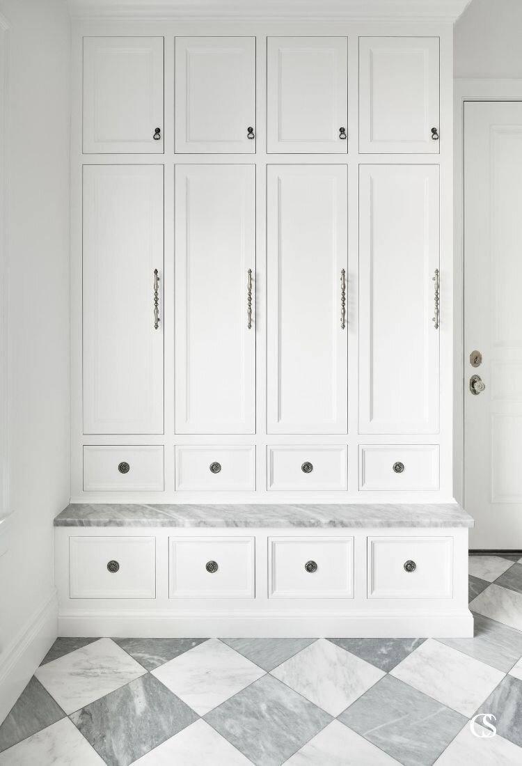
I always say that the best paint colors are the ones that suit you and your tastes. It doesn’t matter what the trending or popular paint colors are if you don’t actually like them. This year’s list of top Farrow and Ball paint colors includes a couple of bold choices that definitely aren’t for everyone. The yellow color Babouche No 23 and the red Incarnadine No 248, while great colors, don’t necessarily have mass appeal. The best Farrow and Ball paint colors are the ones people buy again and again and tend to be more neutral. Here are a few of Farrow and Ball’s best interior paint colors:
Our Favorite Farrow And Ball Paint Colors
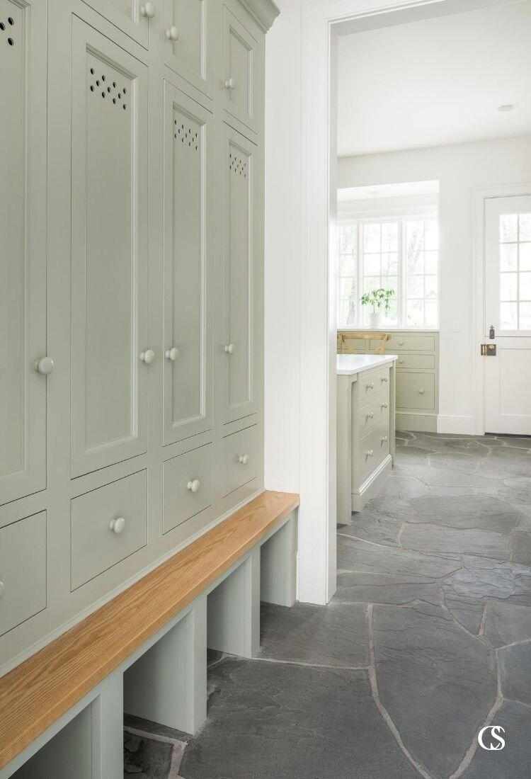
Farrow and Ball paint colors are rich and vibrant because they are tinted with natural ingredients. Try as they might, synthetic colors just can’t achieve the same depth. Even a color matched paint won’t give you the same look as a true Farrow and Ball paint. Here are five of my favorite Farrow and Ball colors:
Paint Color Name: Hague Blue No 30
Why I Love Hague Blue: In contrast to a Farrow and Ball light blue shade, Hague Blue is a deep blue with subtle green undertones.
Where This Color Works Best: I’ve used it on bathroom cabinetry, or any time I want to add personality and style to a smaller space. It’s a bold choice without being overbearing or too trendy.
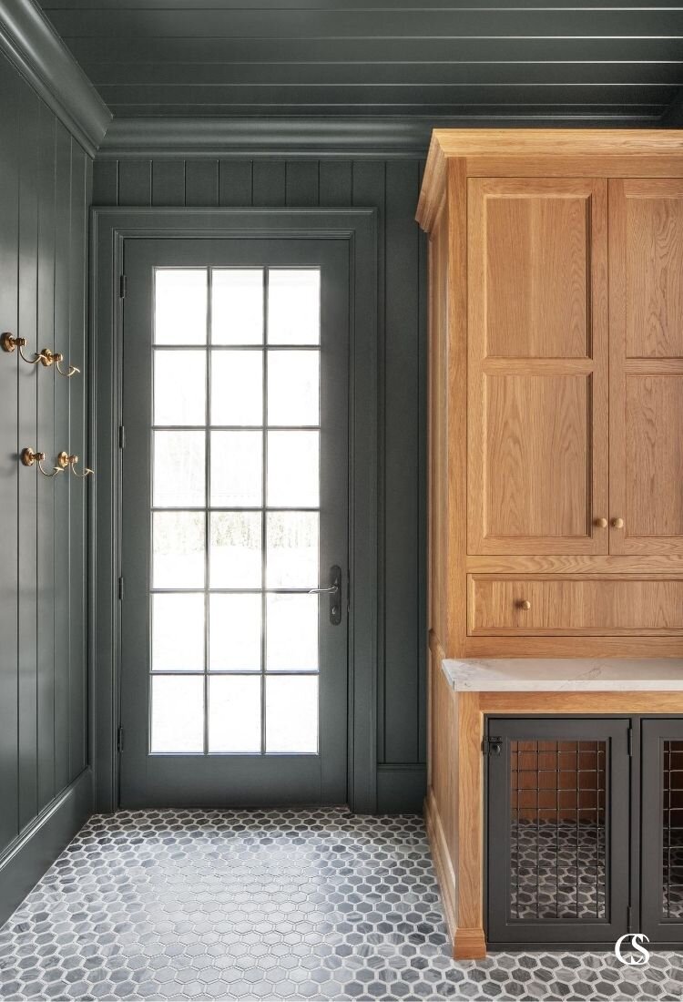
What Other Colors Go Well With Hague Blue: This deep blue color looks good with lighter shades of blue, as well as light grays or shades of taupe.
Other Colors That Pair Well With Hague Blue:
Paint Color Name: Down Pipe No 26
Why I Love Down Pipe: In some lighting, this dark shade of Farrow and Ball interior paint takes on a leaden gray look. At other times, it has a distinctly blue look.
Where This Color Works Best: I love using this color in kitchens and other large areas because the shade changes as you move throughout the room.
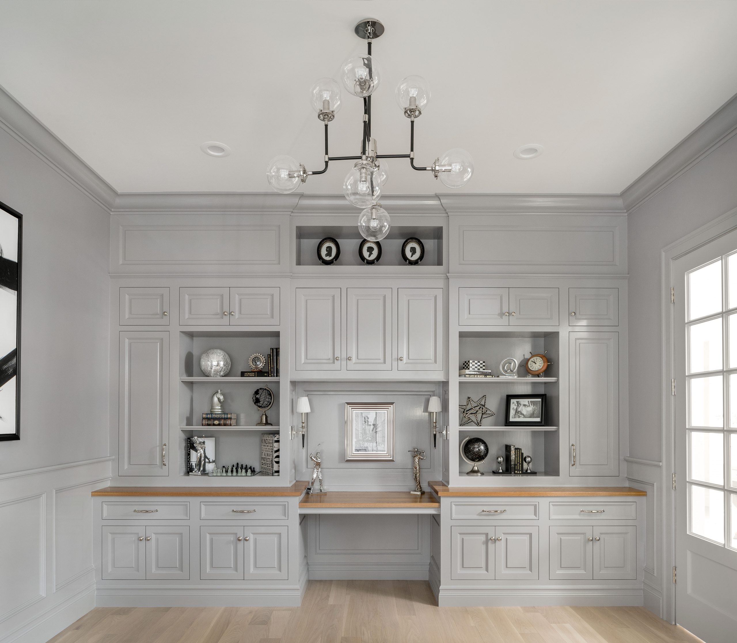
What Other Colors Go Well With Down Pipe: I’ve found I like pairing this dark shade of gray with lighter grays that have taupe undertones.
Other Colors That Pair Well With Down Pipe:
Paint Color Name: Calke Green No 34
Why I Love Calke Green: Calke Green makes a strong statement and is very on trend right now. I love a good green paint, and this one is a real head turner.
Where This Color Works Best: Because it’s a more popular color that is having a moment right now, I would recommend using it in a smaller space, like on a bathroom vanity. It is also one of the more popular paint colors for living rooms right now too if you want to take the color to the walls instead of cabinetry.
What Other Colors Go Well With Calke Green: Darker neutral tones work well to pull out the sage color in this paint.
Other Colors That Pair Well With Calke Green:
Paint Color Name: Lamp Room Gray No 88
Why I Love Lamp Room Gray: If you’re looking for a traditional, even keeled gray, this is the Farrow and Ball paint color for you. This shade carries slight blue undertones, but is a neutral that you’ll likely never get sick of seeing.
Where This Color Works Best: This is a very versatile color you could use in any room.
What Other Colors Go Well With Lamp Room Gray: You can stay in the clean and neutral color palette with Lamp Room, or you can use it as a contrast for a bold dark color.
Other Colors That Pair Well With Lamp Room Gray:
Paint Color Name: Pointing No 2003
Why I Love Pointing: If bright whites aren’t your style, then opt for this warm white. I love the off-white/cream tones that almost have a yellowish hue. It creates an airy, liveable space that is warm and inviting.
Where This Color Works Best: I love seeing this color on walls and in hallways. It also plays well off of bold colors if you want pops of color without closing in a room.
What Other Colors Go Well With Pointing: Sometimes it’s fun to layer neutral colors in a room, and Pointing is a color that works well with other neutrals.
Other Colors That Pair Well With Pointing:
For More Paint Color And Brand Ideas Check Out Our Portfolio
These are just a few of our favorite Farrow and Ball paint colors. To see what other colors we recommend, or for pictures of the finished rooms, take a look at our portfolio and follow us on social media. When you’re ready to chat, contact us for a free paint, cabinetry, or design consultation.

