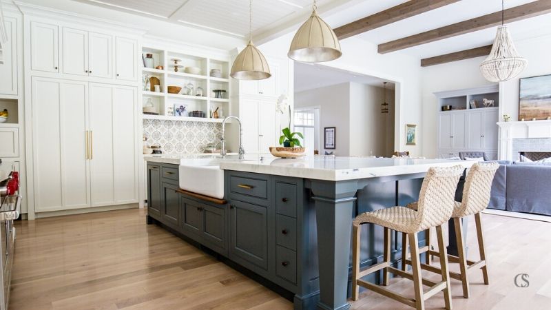
The best kitchen design ideas are those that have flawless functionality and look beautiful simultaneously. When it comes down to it, every custom kitchen is going to be different in each of those areas because what works for one may not necessarily appeal to another. The key is to learn the basics and build from there with your own personal needs and style.
The best kitchen design ideas will incorporate two things:
Style Design: the way you want your kitchen details to look—the color, trim, hardware, etc.
Layout Design: how the room functions, how it’s organized, and how the cabinets are laid out.
There are many questions I’ve compiled over the years, here’s a brief response to many of those questions:
What Is The Best Layout For A Kitchen?
In short, the best layout for any kitchen is the one that works for you and the floor plan. But, no matter what your kitchen design ideas are, there are several things to keep in mind, especially when remodeling or building a new kitchen altogether.
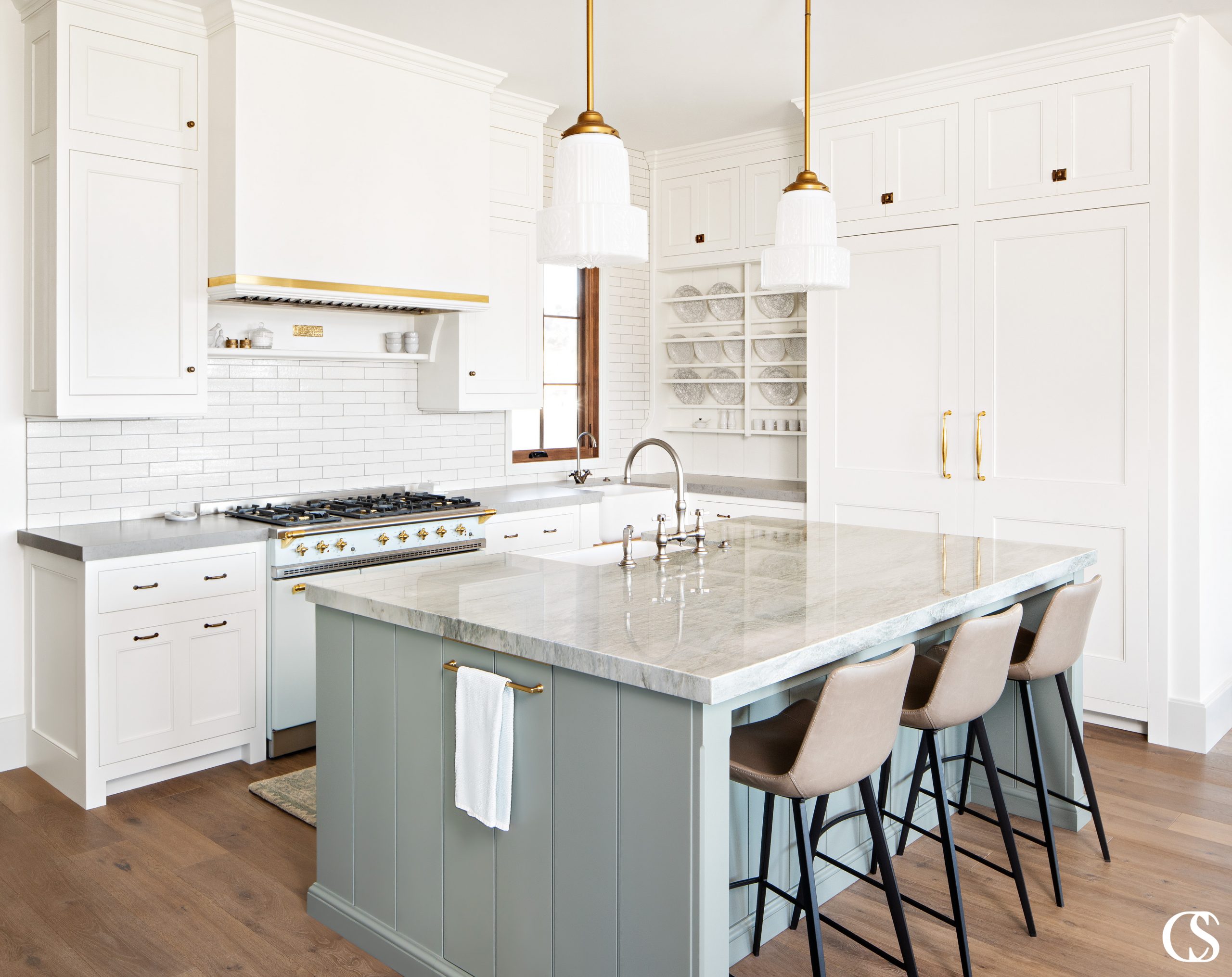
Counter Space
The best kitchen design ideas include plenty of counter space. This is where physical layout becomes crucial to your kitchen design—make sure to plan for plenty of room to store appliances (if they’re not being hidden away in cupboards) as well as to work. Adding an island or peninsula can help with this.
The Work Triangle
First and foremost, a kitchen has to be functional, which means the idea of some sort of work triangle should be observed. The work triangle consists of the three big workhorses in every kitchen: the fridge, the stove, and the sink. Ideally, these three areas of the kitchen should have a somewhat unobstructed path to one another.
Lighting
Don’t underestimate the power of lighting when considering kitchen design ideas. While you’ll want to embrace as much natural light as you possibly can in the space, manufactured lighting will also play a big part in your kitchen. No matter your style, you’ll likely want to install some sort of hanging fixtures, under cabinet lighting or sconces to shed more light on your workspace.
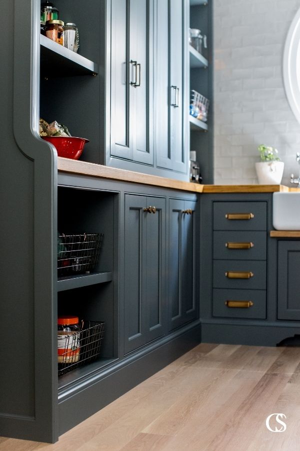
What Are The Different Types Of Kitchen Layouts?
While the overall look of kitchen design can have myriad different variations, there are six basic types of kitchen layouts to consider.
U-Shaped or Horseshoe Kitchen
The U-shaped kitchen is the best for utilizing every ounce of space your room has to offer. Because it embraces three sides of a room for cabinets and/or appliances, there is typically ample counter space and storage. The U-shape also provides the option for an additional island in the center of the room. This kind of design is great for overall kitchen workspace flow.
G-Shaped or Peninsula Kitchen
A G-shaped kitchen is essentially a U-shaped one, with the addition of a peninsula built into one of the open edges of the U. Technically, a peninsula can be added on to almost any shape of kitchen but it is popular in the form of a G-shaped kitchen space. This type of layout is good for a space that may not have the width required for an island in the center of the room. The peninsula can also perform double duty as a type of breakfast bar and room separator.
L-Shaped Kitchen
L-shaped kitchens utilize two walls, perpendicular to one another in the shape of the letter L. It’s also common for an L-shaped kitchen to include an island. This is also a great kitchen layout for smaller spaces, like apartments, where every bit of counter space counts. It creates an efficient workspace and often flows into another room, which is great for today’s appreciation of the “open concept” living space.
Single Wall or Straight Kitchen
If your kitchen design ideas have to take a very small space into account, the single wall or straight kitchen layout is likely best for you. Just as the name implies, the appliances and cupboards/countertops in a single wall kitchen are fixed to one wall.
Galley Kitchen
A galley kitchen, which is sometimes called a walkthrough kitchen, is one where the two longest walls in a rectangular space are the ones at work.
Island Kitchen
Today, just about any of the layouts already mentioned can be enhanced with an island. Depending on the size of your space, an island can provide crucial additional counter space and storage. Or if you’re working with a roomier area, an island can become a part of your working kitchen triangle, housing the sink or possibly the cooktop. Some kitchens with ample room can even benefit from a second island that becomes a dining space as well.
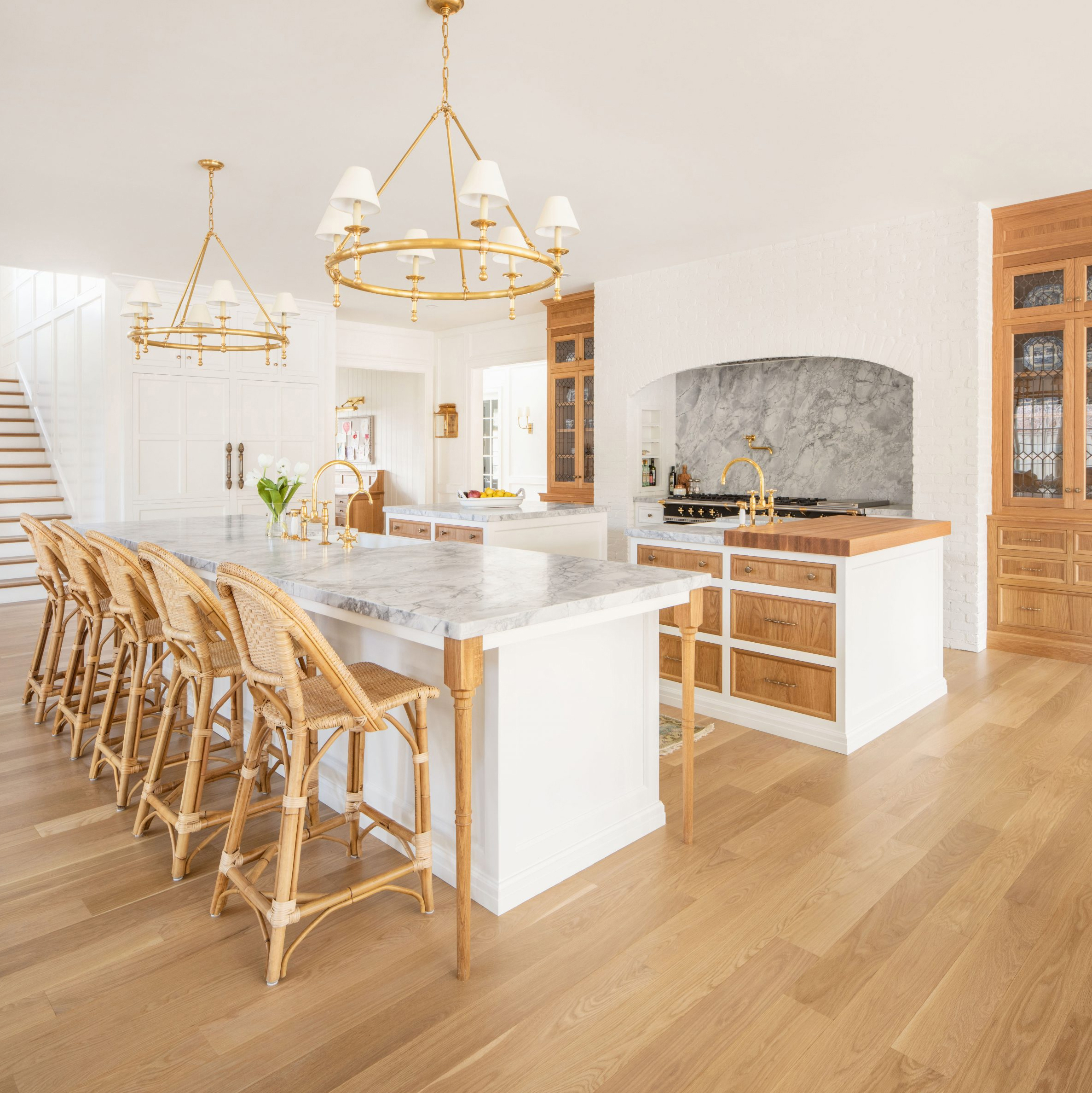
This kitchen was designed to be a show-stopper with two islands, custom lights, and many carefully crafted cabinetry and shelving details. The goal was to achieve a Modern French look with turned legs on the seating island, pyramid-shaped drawer fronts and fridge panels, wire mesh in the gridded cabinet door panels, brass accents, and the flared oven hood with corbels. The two islands are designated as the “work island” and the “seating island”.
PROJECT DETAILS
Work Island Finish: Custom Stain on Plain Sawn White Oak
Cabinet + Seating Island Paint: Simply White by Benjamin Moore
Floors: Prefinished Engineered White Oak
Counter Tops: Quartz
Cabinetry Design: C.S. Cabinetry
Builder: Magleby Construction
Decor + Furnishings: Simons Design Studios

What Is The Most Popular Color For A Kitchen?
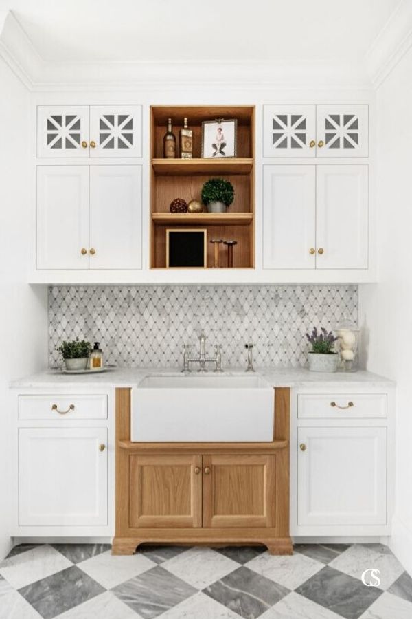
Undoubtedly, the most popular color for a kitchen is white. It’s clean, fresh, bright, and makes a space feel large and open, even if it’s on the smaller side.
That said, there is much to be said for the newer trends of a deep accent paint color—think blues, greens, and even blacks. The beauty of having so many options is that all kitchen design ideas are going to come to life in their own unique ways.
What Would It Cost To Remodel A Kitchen?
There are many factors that go into the cost of a kitchen remodel. No matter your ultimate kitchen design ideas, you’ll have to think about the size of your space, whether or not your overall layout remains the same, the quality of materials you intend to use, the cost of materials and labor in your area (for example, the cost of a kitchen remodel in Utah is different than other areas of the country) and many other smaller details. You could expect the cabinetry to consume about 40-60% of a kitchen remodel budget, depending on the caliber of cabinetry you go with.
Typical Cost To Remodel Your Utah Kitchen
Is there anything unique to Utah that would impact the price? Is Utah different than other places? If you’re thinking of remodeling your kitchen in Utah, this is what you should consider.
While it’s difficult to give exact numbers on how much your kitchen remodel will cost in Utah, due to factors like material prices, labor prices, and other factors, we know that remodeling in Utah is less expensive than in other areas of the country. If you are thinking of remodeling in Utah, plan on a lower price tag than other states, but keep in mind that you get what you pay for, and opting for budget cabinetry rather than custom doesn’t benefit you in the long run.
7 Critical Things To Consider When Designing Your Kitchen
1. Identify your pain points
A great custom kitchen design can solve your particular problems. Start by making a list of your pain points so your architect, custom cabinet designer or interior designer can solve them. Do you need a place to hide mail clutter? Need a better way to deal with trash and recycling? Need more pantry room? Want to hide countertop appliances that you use frequently? These are among the most important things for your cabinet designer to know. They will help them design the right layout for you from the beginning of the design stages.
2. Decide how much island seating you need vs. how much seating you want.
If there’s one thing I’ve noticed every client has figured out, it’s that they want a specific amount of seating at the kitchen island. If you start with the quantity that you absolutely need, it will allow for the best kitchen design without the seating (and therefore, island length) dictating much of the layout of your kitchen or diminishing aisle widths. You should budget 18-24 inches per seat to comfortably accommodate an adult (you can squeeze kids into 18 inches). This means that an 8-9 foot island will accommodate 4-5 seats. Be careful to not let seating space be a priority over aisle space or layout balance and placement.
3. Bigger isn’t always better—when it comes to island width.
I prefer to stay under 4 1/2 feet (54 inches) deep on an island . Any larger than that and you’re going to have a hard time reaching the middle. Although, I’ve done some islands much deeper for reasons of how large the space was or how the island was intended to be used. I would just consider not going too deep for most situations. If you want a reference, my most typical island depths are between 42-54”.
4. Consider how much room you have for island seating overhang.
I’ve done an overhang as little as 7 inches for where you put your legs. It works ok if you just don’t have the space to do more. “Standard” island bar seating includes 12-15 inches of overhang. Any deeper than that and you have to consider additional countertop support.
5. Factor in the width of your aisles.
A typical aisle width is 42-54 inches. At 42 inches wide, someone can load a dishwasher and another person can walk by without any trouble. Smaller aisles can be used, but 36 inches is the minimum width for a kitchen aisle and will feel cramped in a busy kitchen. An aisle that is over 60 inches might feel too wide and the counters will feel too far away to be efficient. Grab a tape measure and go around your current living spaces to get a feel for what those sizes feel like. The biggest thing to consider is that even the smallest aisles are comfortable for one person working in a kitchen. The real frustrations come out when you have other people using the kitchen simultaneously.
6. Think about the various sizes of items you use.
You can use pullout and rollout drawers in a variety of ways to make your life in the kitchen easier and the space more efficient and functional. It’s important to have enough variety of tall and short storage spaces to be as efficient as possible with the space available. If you make every space too large, you will have wasted cubic footage. If you try to be too efficient and make the spaces smaller, you might not have space to put that tall boiling pot or mixing bowl. It doesn’t hurt to go through your current kitchen items and make a list of the large item sizes and any personal kitchen items that are unique to your lifestyle (tea storage, coffee makers, large knife sets, sport bottles, china, tupperware, etc.)
7. Choose the appliances and sink sizes before getting too far into the design.
If you want to avoid wasting too much time, it’s best to figure out the desired size of appliances and sinks in the beginning. This doesn’t mean you won’t end up changing them for layout reasons or uncertainty of family needs, but it gives you a good starting point to work off of.
Utah’s Experts In Kitchen Cabinetry Design, Installation, And Remodels
Christopher Scott Cabinetry is Utah’s best choice for kitchen cabinetry design installation and remodels, but our expertise and services reach across the nation, as we offer our services from the East to West coasts. We are your best choice for custom cabinetry design and installation, not only because we pride ourselves on meticulous attention to detail, innovative ideas to improve functionality, and expert craftsmanship, but because we live here. Whether we are designing cabinetry for a custom home along the Wasatch Front or we are remodeling the kitchen of a brownstone in New York, our passion and perfectionism are rooted in the pride we have for the communities we serve. We love knowing that our designs become part of your daily life, making your space more beautiful and functional. So for you next project, whether you are in Salt Lake, Orem, Ogden or Alpine, or anywhere across the nation, contact us today and find out how we can help take your kitchen remodel from average to exceptional.

